Based on technology, web design trends continuously evolve. They are usually influenced by the cultural changes that are happening around the globe, and the last year was no less than a surprise for everyone residing on the planet earth.
With all the gallons of hand sanitizers and awkward zoom meetings from the last year, we have gone through a blasting cultural change. However, despite all the difficulties, we worked hard enough to move forward in the field of technology. As a result of all those cultural changes, we have come across some amazing web designs for the year 2021.
Today, our focus will be on the latest web design trends to make our readers understand every aspect of those trends. Let us have a look at them all closely.
Best Web Design Trends of 2021
Here is a list of the best web design trends for the year 2021.
A drastic change in fonts
We’ve seen many old things become cool again and then, in turn, become even more uncool. Think handlebar mustaches and mom jeans. Retro fonts have experienced this same flow in their popularity, and many designs featuring vintage typography haven’t aged well. However, throwback typography has gone through a bit of a resurgence. We do not see the same tired fonts. Rather, stylization and a bit of artistry are reimagining what retro fonts can be. Instead of feeling stale and cliche, they breathe new life into traditional bold fonts with a bit of experimentation. This is a good example of taking traditional fonts and giving them a bit of a cool and modern spin while maintaining legibility.
Parallax scroll effect animations
Parallax scroll impacts have been a trend in website design for quite a long time, and in 2021 we desire to see more unpretentious and inventive investigations of what can be refined with parallax. Recall that a lot of movement in parallax impacts can be unsafe to individuals with vestibular problems on the basis that the dream of profundity and development can cause confusion and unsteadiness. Also, for the “blast,” remember that not every parallax animation must make gestures across the screen.
Horizontal page scrolling
A huge amount of web designers are proceeding to try different things with horizontal scrolling. The individuals who do it best break the example not for being different but rather as a viable method to uncover optional data continuously, as in a picture display. Also, designers utilizing horizontal scrolling effectively in 2021 will remember the contemplations that include trying not to drive clients to explore through horizontal substance, instead, permitting substitute approaches to explore, similar to bolt fastens with clear names. Also, utilize clear visual signs to demonstrate where substance utilizes horizontal scrolling, and don’t shroud these signals behind floats.
3D visuals
With the approach of higher goal screens, the 3D design has made considerable progress from the blocky and angled edges of Geocities. There are great 3D visuals meshed flawlessly into web designs. Rather than being flashy interruptions, they’re adding to the general client experience. There are multiple imaginative organizations that toss in runs of profundity with 3D components all through their website. Also, there’s a decent feeling of harmony between the entireties of the design components. This is an ideal illustration of how in more minimalist formats, 3D can establish a consistently greater connection.
Multimedia is the new talk of the town
With a lot of people approaching quicker web speeds, multimedia web encounters are springing up all over. Uniting visuals, text, video, and sound make for a rich client experience. Effective designs in 2021 will utilize requirements with multimedia encounters that include a focus on effortlessness, similar to when joining movement and sound. An excess of going on can be diverting or overpowering to individuals with psychological problems. Also, utilize different media designs nicely as an approach to expand the availability of substance. In addition to this, incorporate alt text for pictures, and go with complex pictures with longer distinct content. Thus, utilizing multimedia viably and accessibly accompanies an obligation to address an assortment of factors.
Augmented reality

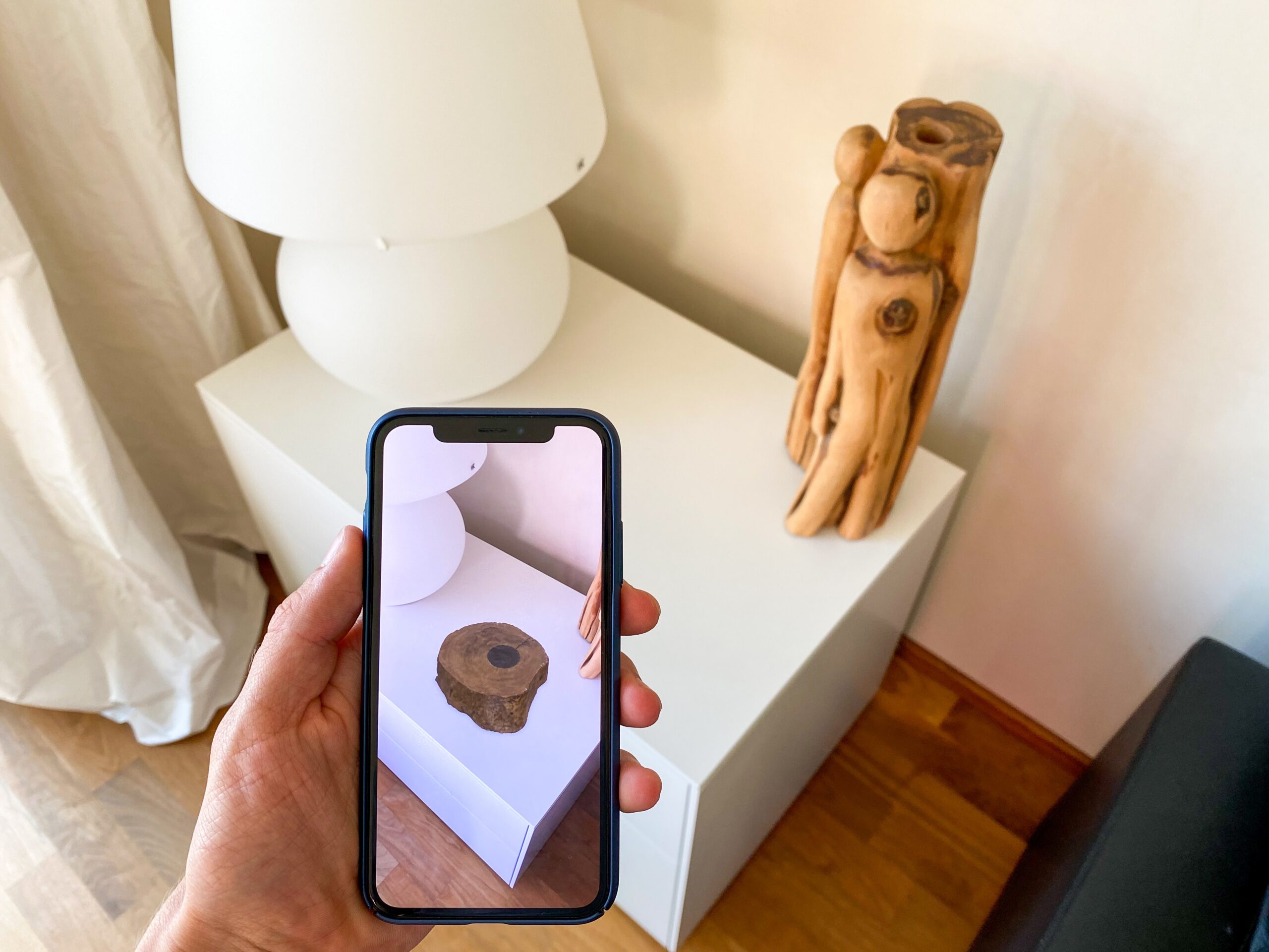
Also, with multimedia encounters, we should not fail to remember the entirety of the astounding vivid encounters utilizing augmented reality. AR implies more than simply chasing for Pokémon on your cell phone. New advances have opened this domain up for nearly everyone. All the more retail and online business websites are taking advantage of the force of AR to help sell their items and engage possible clients in the purchasing cycle.
Some amazing muted colors
Inflexible grids and level blocks of strong tone can truly empty the character out of a web design. Grainy surfaces can give them a more normal feel. Much the same as grains can give a design a more characteristic feel, so can muted colors. The muted tones are the ideal setting for the hand-drawn styled text and illustrations. For a more amazing look, add a marginally humming grain in the background that is practically garbled and an unpretentious bending to the light and dark backgrounds, causing the design to feel a lot invigorated.
Preferred designs
Many well-known web design companies focus on preferred designs, and Web development has made great strides in offering more personalized experiences. This can be anything from including a toggle between dark/light mode and other ways of changing a site’s appearance and navigation to offering content custom-tailored to one’s taste like the custom playlists. New design practices and algorithms are making the internet less of a passive user experience and more user-centered. The future will bring even more of a focus on meeting the needs, wants, and tastes of those navigating through websites.
Amazing Gaussian blur
Gaussian blur functions admirably in giving a twirl of delicate focus to pictures and angles. This impact has been around for some time. However, designers have been utilizing this in more conspicuous spaces in web designs. We love seeing things that have always been around, as Gaussian blur, become more mainstream in possession of designers who are utilizing them in new and fascinating manners.
The animated string of words
An animated string of words will frequently be organized as a specific shape, in spite of the standard horizontal, left-to-right sentence design. Eventually, the component’s job will consistently be for enlivening purposes and not exclusively as a book to be read. Designers will normally utilize this method to pass on a marking or advertising objective, making an ideal vibe or visual subject.
Emojis
Regardless of whether one thousand miles separated or one meter separated inside one house, individuals are continually connecting through their gadget keyboards. This incorporates messages, informing applications, etc. Things have become a long way amazing, as alphanumeric characters joined by perky emojis in composed content components are presently an essential piece of our advanced vocabulary.
The rising prominence of emojis has advanced the web designer’s tool kit, as well. Web designers have taken to the perky, charming language of emojis, utilizing them as a component of their website content itself. Utilizing these outlined signals is presently a successful, straightforward approach to represent the brand opinion and non-verbal informing in a language natural to clients, everything being equal.
Light colors

Utilizing light colors in web and interface design addresses perhaps the greatest difference between print and web design. The quality and permeability of light colors regularly get bargained when utilized on paper design, thus losing their lavishness and showing up as mistier.
Light colors have the contrary impact on-screen and may even be liked over dark, bolder colors. The screen’s sharpness and lucidity can really make such colors domineering and even unpleasant for the natural eye to take a look at. Designers have now accepted the benefit of utilizing light colors to dodge the latter. Truth be told, the additional benefit of utilizing light colors in web design stretches out past the guest’s visual experience — light colors are likewise helpful for client commitment. The mitigating impact of light colors frequently urges clients to remain on the page for more, appreciating the color range’s serenity and warmth.
Cartoonify
There was a period quite recently when websites were simply text and a couple of pictures or illustrations. Web design has advanced, with designers presently doing work that associates with individuals on closer to home level. Cartoon illustrations have acquired prominence as a method of changing websites with a solid scramble of mankind. There are countless sources out there and specialists making fabulous cartoon illustrations.
Print layouts
With digital innovation supplanting such a lot that were once actual objects, there has been a resurrection of old media. The fame of vinyl collections is verification that individuals need to encounter something that isn’t only a lot of zeros and ones. Layouts that get their motivation from prints satisfy individuals’ longing to interface with something in reality. Magazine-styled layouts and different components of customary visual depiction give a connection to the material experience of print on paper.